Skip to main content Skip to footer

DELULU Gaming Now Live on Stake.us with First Game Release

The new game studio has made its first titles available on Stake.us before its formal market launch, giving players early access to its initial portfolio.
DELULU Gaming Now Live on Stake.us with First Game Release

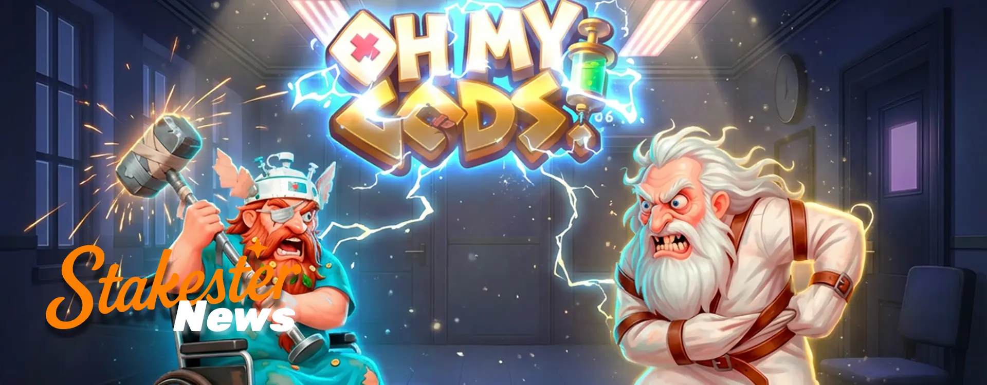
DELULU Gaming's first casino games are now live on Stake.us, making the newly launched studio one of the latest game providers to join the platform's expanding library. The rollout includes titles such as Oh My Gods, Candy Chaos and Dogs Arena giving Stake.us players instant access to DELULU’s first portfolio. For a brand new supplier, launching on an established operator from Day One gives them early exposure in a market where new studios typically take longer to get distribution.

What Is Now Available on Stake.us?

DELULU Gaming's initial collection of titles has been added to the Stake.us lobby as part of the studio's first distribution agreement. And, while the company has yet to formally launch its brand globally, players on Stake. We can already see its games listed with the more established providers.

According to DELULU Gaming, its first releases have been developed with unique visual themes and gameplay mechanics rather than adhering to a template. The games also feature adjustable RTP settings and promotional tools that operators can tailor for various markets, offering platforms the flexibility to introduce the content to players.

For Stake.us users, the launch simply means another provider has joined the platform's growing library. While it's too early to judge how the games will perform over time, early placement on a major operator suggests there is industry interest in DELULU's opening portfolio.

DELULU's First Games on Stake.us

Stake.us players have access to a selection of DELULU Gaming’s launch titles, offering a first look into the studio’s approach to slot design. Instead of a single themed or styled game, the developer has come out of the gate with a varied portfolio combining mythology, martial arts, fantasy adventures, and instant win mechanics.

Among the first games available are:

  • Oh My Gods: A mythology-themed slot where players choose between Zeus and Thor, with each path unlocking different Free Spins features, bonus games, and multiplier mechanics.
  • Candy Chaos: A colorful slot built around explosive Bomb features, bonus choices, and Free Spins that can significantly change the pace of a session.
  • Dogs Arena: A martial arts-inspired release featuring expanding reels, player-selected Wild fighters, and progressive bonus features that increase volatility as gameplay develops.

Why This Matters
Why This Matters

The competition among online casino game providers is getting more intense as new studios try to find ways to stand out in a market where the biggest brands are already in place. Getting your games in front of players quickly is a key challenge for emerging developers.

Starting with a renowned operator such as Stake.us over that hurdle. Instead of waiting to build distribution gradually, DELULU enters the market with immediate visibility on a platform that already attracts a large player base. That exposure could provide valuable early feedback while helping the studio establish its reputation during its first months in the industry.

For Stake.us, adding new suppliers also supports a broader trend of regularly refreshing its game selection with new content, giving players more variety beyond existing providers.

What Happens Next

DELULU Gaming is expected to continue expanding its distribution following its official launch. The company has indicated that the Stake.us release is only the first step in a broader rollout, with additional operator partnerships and future game releases already planned.

For now, Stake.us players have become the first audience able to try the studio's games, allowing DELULU to begin building recognition before its wider expansion across the online gaming market.

Reference

DELULU Gaming

About the author

Paula

Paula is a dedicated iGaming content creator with a passion for sweepstakes casinos and online slots. Formerly crafting engaging guides on social casino promotions and U.S. gambling regulations, she now delivers the latest news and insights for Stakester. Follow her breakdowns of player incentives, crash game trends, and industry updates to level up your gaming knowledge.

Stakester Newsletter

Be the first to find out when a sweepstakes casino launches and receive exclusive offers directly in your mailbox.

Loading
There was an issue loading your website design settings.
There was an issue loading Google fonts.
You have been logged out of the Umbraco CMS, please login again to make your changes.
An error occured. Unable to save your design settings.
Unable to save design panel changes due to invalid uSkinned License.
Preview and select the header layout you would like to use on large screens.
{{styles.themeLayout.showHeaderScrollLarge ? 'Yes' : 'No'}}
{{styles.themeLayout.transparentLargeHeader ? 'Yes' : 'No'}}
Preview and select the header layout you would like to use on small screens.
{{styles.themeLayout.showHeaderScrollSmall ? 'Yes' : 'No'}}
{{styles.themeLayout.transparentSmallHeader ? 'Yes' : 'No'}}
Style modal window links in the main navigation as a mega menu. {{styles.themeLayout.mainNavModalMegaStyle ? 'Yes' : 'No'}}
Choose the number of lines that should appear for your burger navigation icon.
These are used globally, from your navigation dropdowns to your back to top button. Choose the global style to be used.
Choose the global direction you would like your breadcrumb icons to face.
Choose the global options for your heading and secondary heading separators.
Choose the global zoom effect for images on hover. {{styles.themeLayout.imageZoomEffect ? 'Yes' : 'No'}}
All images are lazy loaded to improve page speeds. A low-resolution placeholder image will be displayed first before your full image loads. Choose the Global style to be used.
{{styles.themeLayout.imageBlur ? 'Yes' : 'No'}} Smoothly transition from a blurred placeholder image to provide visual feedback.
Choose the global style of your logo link.
{{styles.themeLayout.logoLinkUnderlineInitial ? 'Yes' : 'No'}}
{{styles.themeLayout.logoLinkUnderlineHover ? 'Yes' : 'No'}}
Choose the global style of your main navigation links.
{{styles.themeLayout.mainNavLinkUnderlineInitial ? 'Yes' : 'No'}}
{{styles.themeLayout.mainNavLinkUnderlineHover ? 'Yes' : 'No'}}
Choose the global style of your secondary navigation links.
{{styles.themeLayout.secondaryNavLinkUnderlineInitial ? 'Yes' : 'No'}}
{{styles.themeLayout.secondaryNavLinkUnderlineHover ? 'Yes' : 'No'}}
Choose the global style of your content links.
{{styles.themeLayout.contentLinkUnderlineInitial ? 'Yes' : 'No'}}
{{styles.themeLayout.contentLinkUnderlineHover ? 'Yes' : 'No'}}
Choose the global style of your footer links.
{{styles.themeLayout.footerLinkUnderlineInitial ? 'Yes' : 'No'}}
{{styles.themeLayout.footerLinkUnderlineHover ? 'Yes' : 'No'}}
Choose the global style of your button links.
{{styles.themeLayout.buttonLinkUnderlineInitial ? 'Yes' : 'No'}}
{{styles.themeLayout.buttonLinkUnderlineHover ? 'Yes' : 'No'}}
Choose to display and set the horizontal position of your 'Back to top' link.
{{styles.themeLayout.displayBackToTopOption ? 'Yes' : 'No'}}
Set the horizontal position of your 'Notification' pop-out.
Create a color palette to be used in your design. Your choices will appear within the color picker for easy selection.
Build up the baseline color palette of your theme..
Build up the full color palette of your theme by choosing any number of background, headings, text and link color combinations. Add as many combinations as you wish.
Build up a full range of button color combinations to be used for call to actions throughout your website. Add as many combinations as you wish.
Build up a full range of label color combinations to be used to highlight text. Add as many combinations as you wish.
Set the width of your site container.
{{styles.themeSpacing.fixedWidth == true ? 'Yes' : 'No'}}
Please note: When a 'Maximum width' is set, you will only be able to preview it when the design editor drawer is closed.
Set the padding applied from the viewport edge.
Set the box shadows used for your site container. This will only be visible when you have set a maximum site width on your site container.
Set the padding from the viewport edges.
Set the size and padding from the viewport edges of your 'Back to top' button.
On small screens your back to top button will be full width.
On large screens your back to top button width and height will be the same.
Set the width of your header container.
{{styles.themeSpacing.headerFixedWidth == true ? 'Yes' : 'No'}}
Set the height of your header on various screen sizes.
Height on small screens.
Height on large screens.
Set the width of the dropdowns in your main navigation.
This layout is used once there are {{styles.themeSpacing.mainNavMultiColumnItems + 1}} child items in the dropdown
Set the box shadow of your site header.
Set the padding around the site logo in the header. Set the padding around the site logo when the small header height is used.
Set the padding around the site logo when the large header height is used.
Set the maximum width of your content.
Set the padding used on individual items.
Padding of small items
Padding of large items
Set the width and radius of borders.
Set the box shadow settings.
Set the width of your footer container.
{{styles.themeSpacing.footerFixedWidth == true ? 'Yes' : 'No'}}
Set the spacing at the bottom of a component when the 'Full' page layout option is not selected.
Set the spacing at the top and bottom of a component when the 'Full' page layout option is selected.
Set the width of the 'Intro' column on components when the 'Full' page layout option is selected.
Set the width of the 'Outro' column on components when the 'Full' page layout option is selected.
Set the width of the content of a component when you have chosen the option 'Center' and the 'Full' page layout option is selected.
Set the width of the content column found in banners.
Set the width and radius of form field borders.
Set the width and radius of button borders.
Set the box shadows of buttons.
Set the padding of all buttons in your site. Set the padding of small buttons.
Set the padding of medium buttons.
Set the padding of large buttons.
Control the settings of components inside modal windows.
Control the settings of pods inside modal windows.
Control the backdrop settings inside modal windows.
Select the fonts to be used across your site. You can choose between System Fonts or Google Fonts.
Select your font family from the list.
Select the style of your font.
Select the weight of your font.
Please enter the web project ID provided by Adobe Fonts.
Enter the font family provided by Adobe Fonts.
Enter the font style provided by Adobe Fonts.
Enter the font weight provided by Adobe Fonts.
Your 'Adobe Font' will not work against your Typography until you confirm your settings.
The Adobe font with Web Project ID: {{item.adobeProjectId}} cannot be found. Please check your settings are correct and try again.
{{item.adobeProjectId}}
{{item.adobeFontFamily}}
{{item.adobeFontStyle}}
{{item.adobeFontWeight}}
Copy the URL of the woff2 font file uploaded to your media section. For example: /media/*****/*****.woff2
Enter the font name of your custom font.
Enter the font stack of your custom font.
Your 'Custom Font' will not appear in Typography until you confirm your settings.
Your custom font file was not found. Please check the woff2 file location you entered is correct and try again.
{{item.customFileWoff2}}
{{item.customFontName}}
{{item.customFontStack}}
Assign the fonts you have added above to the different parts your site.
{{styles.designName}}
Your changes are being saved and published, please wait.
Make the text on your page editable. {{editText ? 'Yes' : 'No'}}
Please note, any text changes you make will NOT be saved. This is for testing your design only.